Lead UI Designer
UI Design, Art and Engineering

Red Faction Armageddon was a sequel to Red Faction Guerrilla but went in a different direction both in story and gameplay. All interface was designed to feel high tech. The interface was created to live inside the player character’s artificial intelligence. I wanted the screens to have a digital clock work feeling with many layers of data being processed, like the player was looking into the heart of the AI. All the screens were designed with this in mind. The main menu was designed to showcase different videos in the background that were tied to the player’s save file, so that the front end of the game was always changing to match player progression.
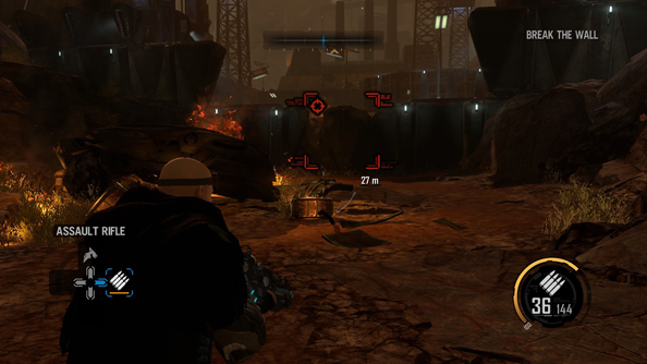
The HUD in RFA was a challenge because it was designed for an open world game that shifted to linear shooter halfway through production. I was able to reevaluate the needs of design and redesign everything. I implemented something design and art direction were still happy with and met the concerns of design and play testing feedback. We tried to keep the HUD as lightweight as possible and only show what the player needed at any given time. The weapon select, reticule and objectives would drop out when not active. The red object cross hairs scaled and faded or dropped out when no objective was in range. We moved from a mini map to a compass at the top of the screen to combat play test concerns of awareness of enemy location.

Due to scope reduction, all scripted moments where the player encounters a new weapon, were removed. This happened late enough in production that we needed a quick solution. I designed a new weapon popup that alerted the player to the new weapon, it’s firing modes and gave a brief description. This helped players feel rewarded and informed. The popup also allowed for design to use it for other unlocks like new abilities.
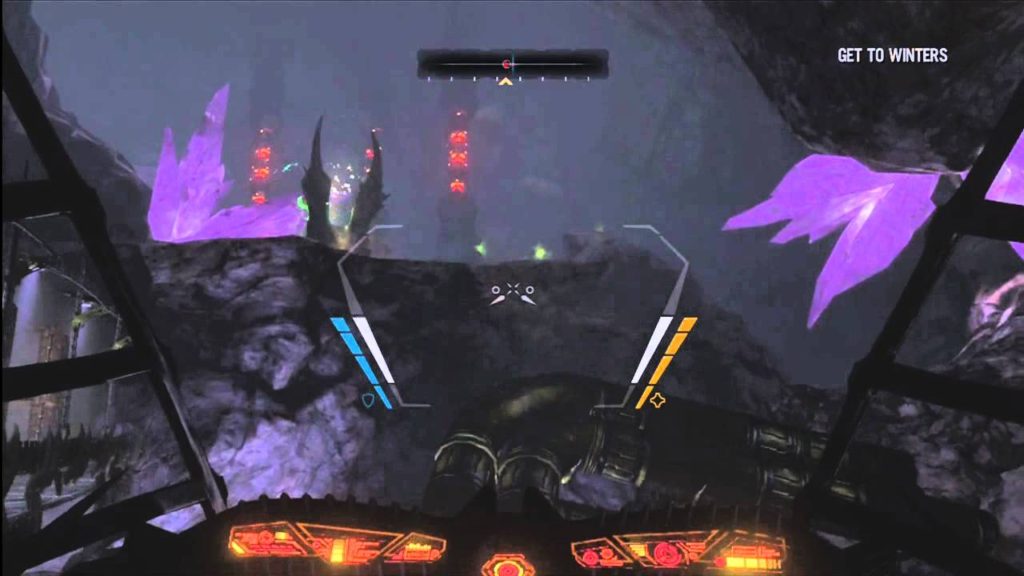
Along with all the standard HUD elements we also had vehicles the player could pilot. We needed the reticle to complement each vehicle and create a more immersive user experience.

I created a dynamic load screen system that could handle different layouts and information types set by design. I worked closely with character, vehicle and weapon artists to get the assets for these screens. I also pushed our internal UI tool farther than we thought it could go with fake 3D perspective and complex animations. Design and art direction were really happy with the outcome and the marketing team asked for the assets so that they could use the layout style.

I created all the achievement icons for Armageddon. I chose a container shape that would complement the UI and a color scheme for Single Player, Multiplayer and General Achievements.
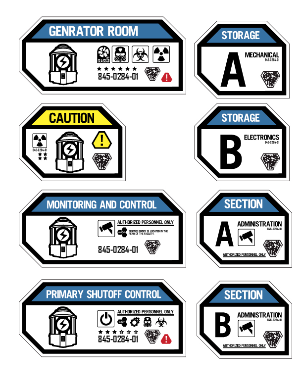
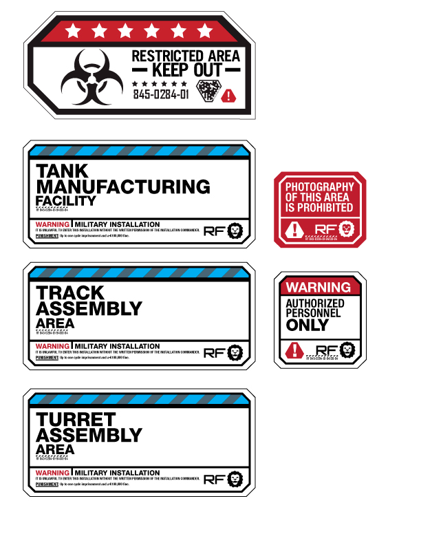
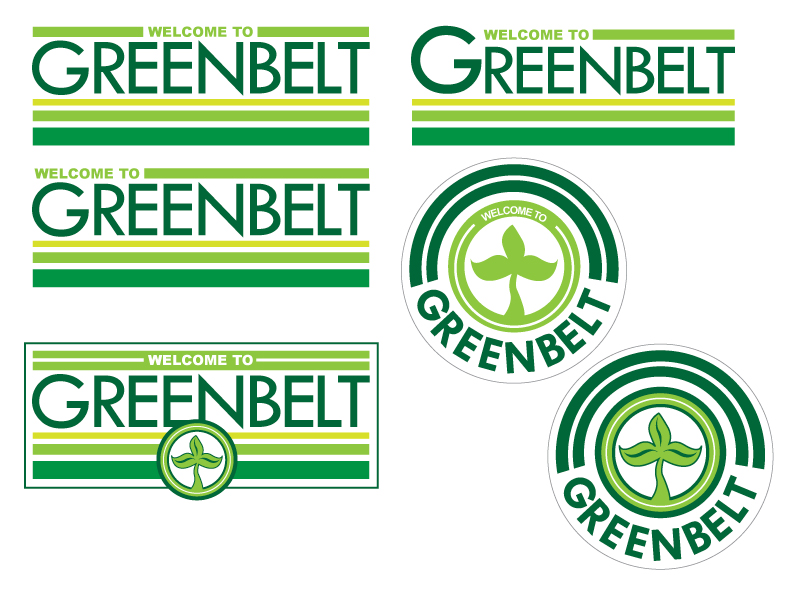
I worked with the environment art team to create signage to both bring the world of Mars to life but also drive the player to important mission specific locations.


