Lead UI Designer
UI Design, Art and Engineering
GOALS:
- Create a new contemporary style for XCOM UI that compliments the more realistic graphics of the sequel.
- Improve user flows and and increase usability of returning and new features.
- Remove standard 2D UI while communicating the same information to the player, creating a more engaging user experience.
XCOM 2 is a sequel to XCOM: Enemy Unknown with a more realistic art style and a similar feature set.

On X2 we made large changes to how the strategy layer base, the Avenger, would be represented to the player and how they would interact with it.
This wireframe explores how much space the Avenger could take up on screen giving you a silhouette of the ship and access to all the rooms inside. We also needed to see how much space rooms would take up inside that silhouette and where all core named facilities would be in addition to the areas the player could expand into.
When selecting a room the player would be taken to a cut away of the room with a HUD specific to that room. Staffing rooms was a new feature for X2, so we spent time figuring out how that could work with all the other requirements rooms had like building gear or upgrading the facility.
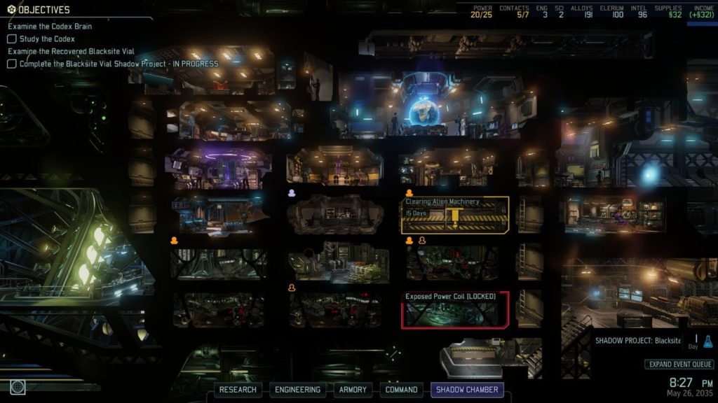
The Avenger that shipped in X2 is very similar to the wireframes and designs I worked on early on in development. We were able to build something that felt like the ant farm base in XCOM but added enough new features to feel new and interesting to the player.
After playtesting and internal feedback we added a quick menu so that players could still access rooms without interacting with the environment.

Each room in the Avenger had its own environment with that actual characters staffed in them stationed around the room. We were able to use a consistent HUD layout around all rooms so that all player interactions felt similar even when the functions of the rooms were very different.

For room construction in X2 we wanted to improve what we had done for XCOM by loading a projection of the 3D environment before the player committed resources to building it. I worked with a tech artist to create a low cost 2D render of the room that we then applied a material to create the animated scan and distortion.

I worked with a cinematic artist to improve the post mission flow of X2 from XCOM. Instead of a spreadsheet of your squad after the mission popping up when you return to the base I pitched that we use the permission squad select screen layout with each soldiers results. This also allowed the player to see their soldiers post mission. This pushed the emotional attachment seeing soldiers celebrate, be wounded or not be there at all if they were killed or captured.
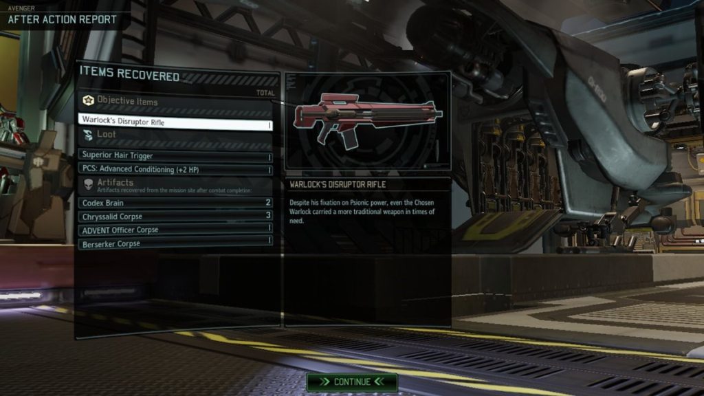
The screen flow here transitioned down into the Avenger following the Skyranger decent on the elevator giving the player the rest of their post mission loot and then over to Tygan for any research recovered.

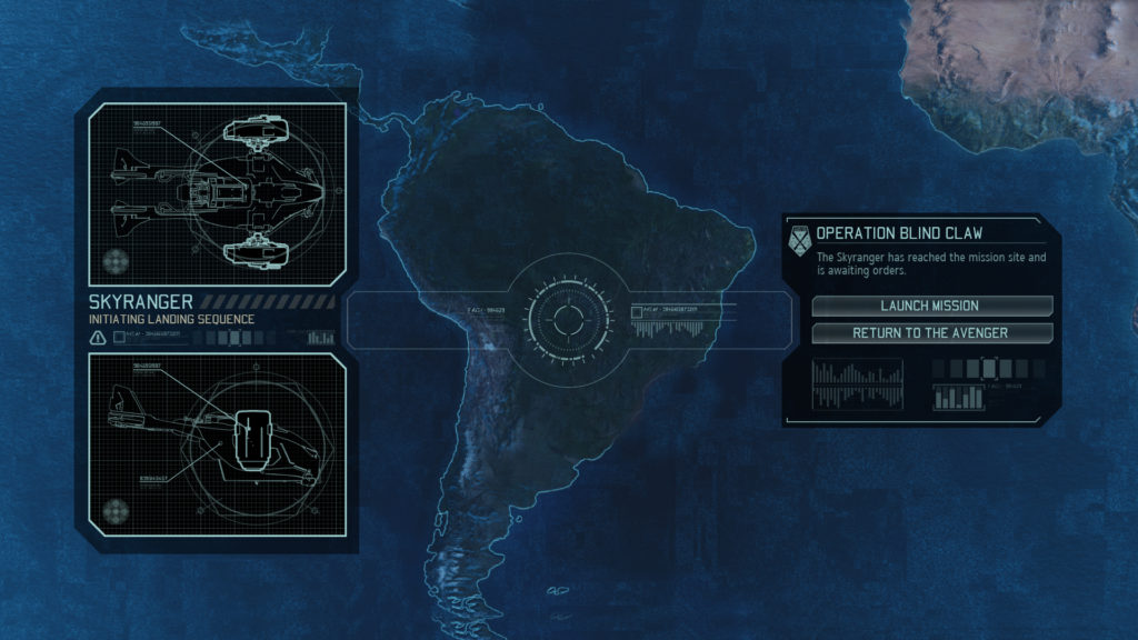
We also changed the Geoscape gameplay from XCOM for X2. We wanted more gameplay in this space with more depth than scanning and waiting for projects to complete. It was a challenge to show all the information and keep the map clear for all the new interactions. We used both 3D icons and 2D flags for things on the map. We also had quick navigation at the bottom center to access all the active missions.

Similar to XCOM we wanted to have different alerts on the Geoscape. They needed to deliver similar information and function in a way that the player could quickly get the information they needed while visually having enough variety so that they matched the theme of their source. Alien alerts needed to look “evil” and all match. We did this with color palette and edge shapes. XCOM alerts were all blue and had different framing elements. Alien Ruler DLC all had a sinister green and different framing elements.

One of the major changes to the tactical side of the game was streamlining the shot HUD. We added extra stats to drawers to the right and left of the HUD and I reorganized everything to take up less vertical space on the screen. These changes allowed more of the game world to be visible.


We updated the Unit Flags for X2 to be more streamlined. We removed the stacking pips from XCOM and used a meter with clear segments. We also tried to pack the same information as XCOM in a smaller space so that it took up less space on screen. This helped to cut down on overlapping issues when several units were on screen and standing near each other.
Early in development I created some propaganda posters for use in the environments. We knew that the Aliens won, so the cities in X2 would need to be populated with pro-Alien propaganda.
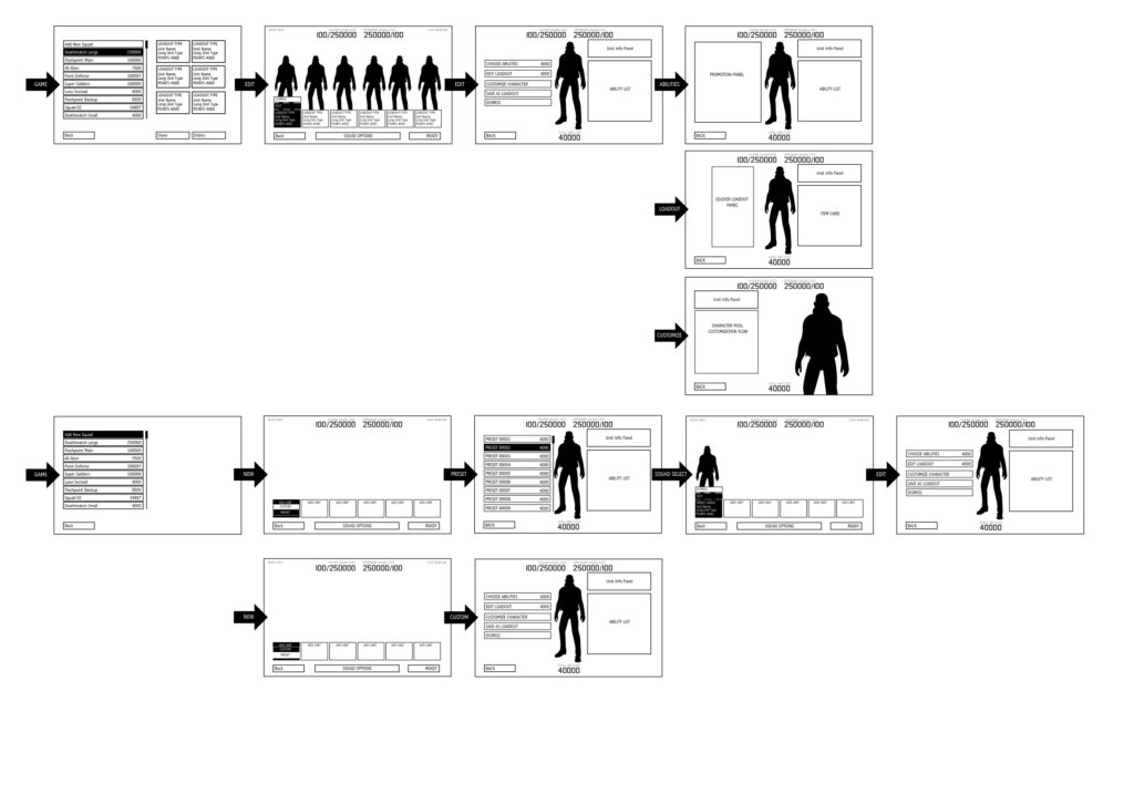
Design wanted the multiplayer component in X2 to be deeper than what XCOM offered. Early on I created wireframes to try and figure out the scope and on boarding process for creating a squad and setting up a match. Production gave me and an engineer 2 weeks to create the front end and get it working.

We tried to reuse the squad select from single player, so that squad selection would be consistent across all game modes. There were new challenges here since the player could have Advent and Alien units on their squad. We had to setup different spots for large units to render on so that they would fit in the lineup.
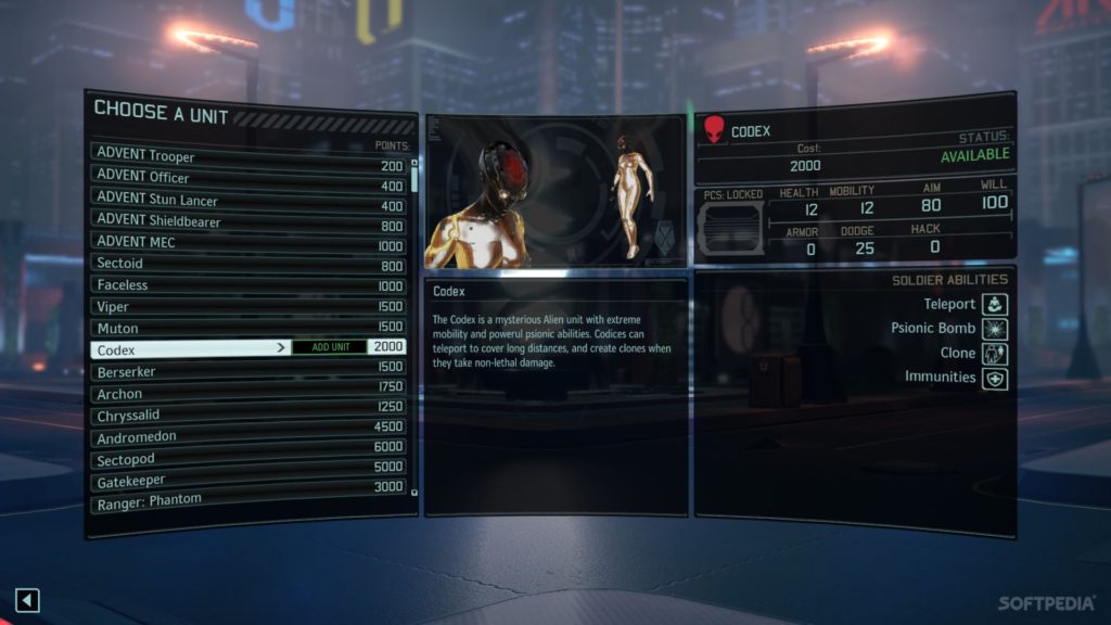
Since we only had two weeks to create everything and get it working we reused components from single player where ever we could. This not only saved time but created more consistency between single and multiplayer.
